
LibraryWhat changed since Monday is a better question than any dashboard
What changed since Monday is a better question than any dashboard
Show what moved since a fixed point, against the same days a week earlier, filtered by a materiality line per metric, with every sentence built only from two computed values. A leader's first question is about change, and change is where dashboards are weakest.
A dashboard is a map of the current state. An executive almost never asks about the current state first.
Monday, 7:40
Picture the first ten minutes of a Monday for anyone who owns an operation. Coffee, a laptop, a meeting at eight. They open the operations dashboard and see forty tiles, every one of them correct and none of them answering the question in their head, which is not "how are we doing?" but "what is different from last week, and does any of it need me?"
A dashboard is a map of the current state. An executive almost never asks about the current state first. They ask about change, because change is what they can still influence and what someone will ask them about at eight o'clock.
So we built the view that answers that question, and found that most of the work was not drawing it. It was deciding what counts as a change at all.
Three decisions that make the answer honest
The first decision is the comparison window. "Since last Monday" sounds simple until a reader opens it on a Thursday. Comparing Monday to Wednesday against the whole of the previous week flatters every count, because three days of incidents will almost always be fewer than seven. Our view compares the days since the most recent Monday with the same weekdays one week earlier. On a Thursday that is Monday to Wednesday against Monday to Wednesday. When the last complete day is a Sunday, it is the full week against the full week.
The second decision is materiality. A week-over-week view that reports every movement is a dashboard with arrows on it. Each governed metric in our semantic layer carries a line in its own unit before it can be mentioned: a tenth of a point of service-level attainment, two incidents or thirty percent, a quarter of restore time, five percent of operating cost, fifty thousand dollars of open risk, fifteen percent of the hours that automation saved. A change is reported only when it crosses its line, and the reported changes are ordered by how far past the line they are.
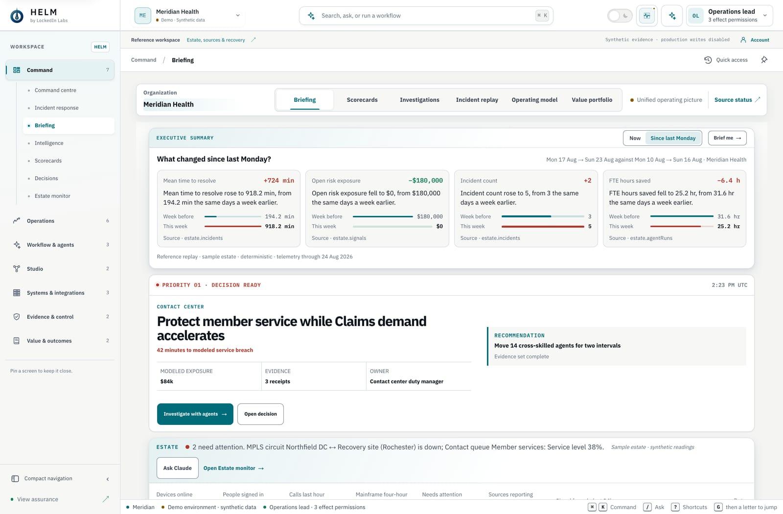
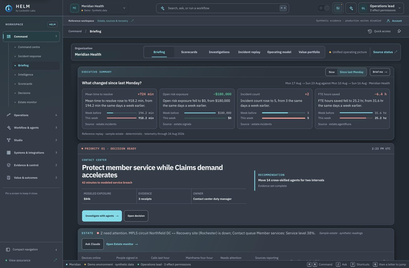
The third decision is the sentence. Every movement is told in one sentence, and the only numbers allowed in that sentence are the two values the engine computed, this week and the same days a week earlier. "Mean time to resolve rose to 918.2 min, from 194.2 min the same days a week earlier." No adjective the data did not earn, no projection, no cause.
What it said about one sample client
On the sample estate the product ships with, the view for one healthcare client reads four movements. Mean time to resolve rose from 194.2 minutes to 918.2. Open risk exposure fell from $180,000 to zero. Incidents rose from three to five. Hours saved by automation fell from 31.6 to 25.2. Service-level attainment also moved, from 99.65 percent to 99.60, and is not on the list, because five hundredths of a point is inside its line.
Read that list as a leader would. Restore time quadrupling is the conversation for eight o'clock. The cleared risk is good news someone should be thanked for. The incident count and the automation hours probably belong to the same story, since fewer automated resolutions and more incidents tend to travel together, and a good operations lead will check that before the meeting rather than during it.
None of that interpretation is in the view. The view states four facts in four sentences and puts a pair of bars under each, last week and this week on one scale. The interpretation is the reader's job, and the view is designed to make that job take two minutes instead of twenty.
Where the view lives, and when it refuses
The view is not a new page. It is a toggle on the executive summary at the top of the command center, Now or Since last Monday, because the person who needs it is already looking at that summary and should not have to go anywhere to see what moved. Switch it on and the four summary cells give way to up to four movement cards, each with its sentence, its two bars and the source the figures came from. Switch it off and the summary is exactly as it was.
It also refuses, on purpose. The comparison runs against a deterministic history of the sample estate, and only some reference organizations have one. For an organization without that history, the toggle does not appear, and the endpoint behind it answers with a named refusal rather than another organization's figures. We would rather show a leader nothing than a confident week-over-week story about a business that is not theirs. Customer production fails closed the same way until a real history source is connected and admitted.
Why not let a model write the summary
The obvious objection is that a language model could write a better Monday summary than four templated sentences. It could connect the restore time to the incident count, suggest a cause and draft the note to the team. We use Claude elsewhere in the product for exactly that kind of interpretation.
We kept it out of this view on purpose. A summary that a model writes is an interpretation, and an executive's first read of the week should be facts they can repeat in a meeting without checking. When the sentence is built only from two computed values, the person reading it can say it out loud with the same confidence they would have in the underlying report. When a model wrote it, they should check it first, and a view that needs checking before it can be repeated has failed at the one thing it was for.
The model belongs one click later. Ask Claude about the same facts, and it reads them as admitted evidence, cites them and proposes what to look at next, clearly marked as an interpretation. Facts first, then interpretation, never blended.
The same machinery, asked differently
Once a semantic layer can answer "what changed" honestly, it can answer a larger family of questions with the same discipline. The dashboard builder in the product works on that principle. Ask it for a dashboard on one client's service levels this month and it composes four headline figures with their change against the previous thirty days, the daily trend, what changed since Monday, a ranking and a table. Every figure comes from the same governed definitions, and every panel names its source.
When the engine declines a panel, the dashboard says so. Client health, for instance, is scored per client and has no daily grain, so a request for its daily trend is refused and the refusal is shown, rather than a line drawn through numbers that do not exist.
That refusal is the quiet test of the whole approach. A reporting layer that will draw a chart it cannot support will eventually write a sentence it cannot support, and the first time a leader repeats that sentence in a meeting, the layer has spent the trust it took a year to earn.